Most candle reviews are purely anecdotal. Candlegraph uses a normalized calibration engine to strip away “size bias” and “luxury markups” to find the true engineering value of a scent.
1. The Relational Baseline
All Candlegraph indexes are relational — they compare each brand’s performance against the current collection average. An index of 100 always represents the average performance across all candles in the collection.
This means:
- Above 100 = Better than average
- Below 100 = Below average
- The baseline shifts as the collection grows
This approach naturally accounts for candle size differences because larger candles typically cost more per ounce, and price is already factored into the efficiency calculation.
2. The SAV Index (Scent Adjusted Value)
The SAV measures Scent Density. It rewards candles that deliver exceptional fragrance performance relative to the collection average.
We use a 40/60 Weighted Split:
- 40% Cold Throw: The out-of-the-box potential (static assessment)
- 60% Hot Throw: The measured performance during burns (active assessment)
The Formula:
$$\text{Weighted Scent} = (\text{Cold Score} \times 0.4) + (\text{Hot Score} \times 0.6)$$$$SAV = \left( \frac{\text{Brand Avg Weighted Scent}}{\text{Collection Avg Weighted Scent}} \right) \times 100$$Example:
- Brand X average weighted scent: 4.2
- Collection average weighted scent: 3.5
- SAV = (4.2 / 3.5) × 100 = 120 (20% above average)
3. The PAE Index (Price-Adjusted Efficiency)
The PAE measures how much burn time your dollar actually buys. It calculates the hours achieved per dollar spent, indexed against the collection average.
The Formula:
$$\text{Efficiency} = \frac{\text{Total Burn Hours}}{\text{Price (USD)}}$$$$PAE = \left( \frac{\text{Brand Avg Efficiency}}{\text{Collection Avg Efficiency}} \right) \times 100$$Why this works:
- Larger candles cost more (naturally weighted by size)
- Luxury markup is exposed (you pay more per hour)
- Value is measured in what matters: usable time per dollar
Example:
- Brand Y: 150 hours / \$50 = 3.0 hrs/\$
- Collection average: 2.5 hrs/$
- PAE = (3.0 / 2.5) × 100 = 120 (20% more efficient)
Important: Burn sessions are capped at 4 hours (industry safety guideline), except for final burns where the candle is allowed to burn to completion naturally. This ensures fair comparisons and data quality.
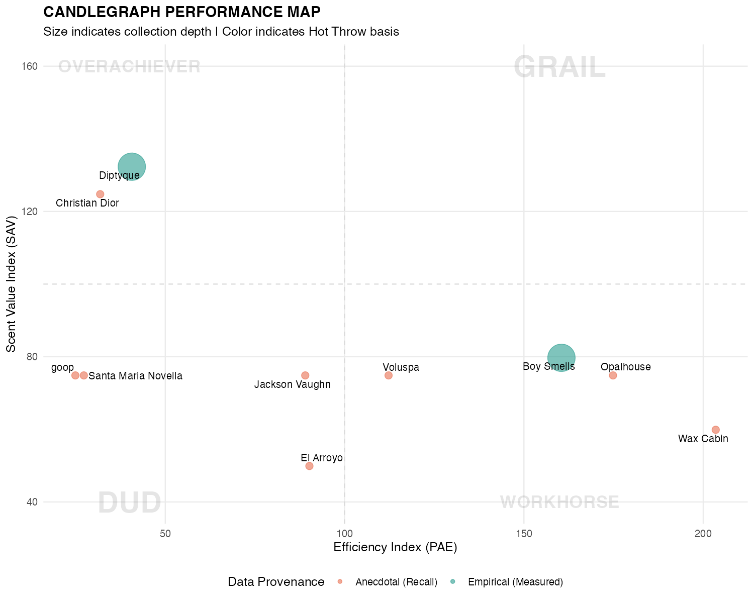
4. Understanding the Quadrants
When we plot SAV against PAE, four distinct categories of candle engineering emerge:
| Quadrant | Character | Strategy |
|---|---|---|
| THE GRAILS | High SAV / High PAE | The Unicorn. Elite scent performance and longevity at a fair price. |
| OVERACHIEVERS | High SAV / Low PAE | The Luxury Play. Elite sensory experience, but you are paying a “luxury tax” for the brand. |
| WORKHORSES | Low SAV / High PAE | The Daily Driver. Exceptional value. Perfect for consistent, daily background ambience. |
| THE DUDS | Low SAV / Low PAE | Failed Engineering. Poor scent output and expensive burn time. |
5. Data Provenance (The Evidence Scale)
In the spirit of technical honesty, we track the reliability of our data. Not all metrics are created equal.
-
● Empirical: The Gold Standard. Throw measurements were recorded in real-time with contemporaneous notes during burns. This data reflects actual observed performance.
-
● Anecdotal: Recalled. The data is based on best-memory reconstruction from candles burned before systematic tracking began. These scores are honest estimates but lack the precision of measured data.
Brands with fewer than 3 candles receive a 20% Confidence Tax on both SAV and PAE indexes, regardless of data provenance. Small sample sizes introduce higher variance, and the penalty reflects this statistical reality.
6. Why the “100” Line Moves
These indexes are relational. An index of 100 always represents the current average of the collection.
As the collection grows and I discover better-engineered candles, the average shifts. This forces brands to “compete” for their spot on the map. A “Grail” today must continue to outperform new entries to keep its title.
This creates a living benchmark — not a fixed standard that becomes outdated, but a dynamic comparison that evolves with the collection.
Current Performance Map
The Candlegraph Engine is a technically sophisticated system powered by R, pulling live data from Google Sheets to ensure the performance map always reflects the most recent burn logs and calculations.